Jack Chen: Global trade and external rebalancing
2023-09-25 IMIThis is based on the speech by Jack Chen at the Macro-Finance Salon No. 214 held by IMI on September 14, 2023.
Jack Chen, Deputy Division Chief of the Open Economy Macroeconomics Division, Research Department of IMF
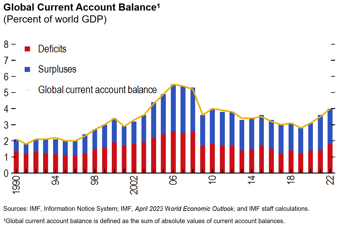
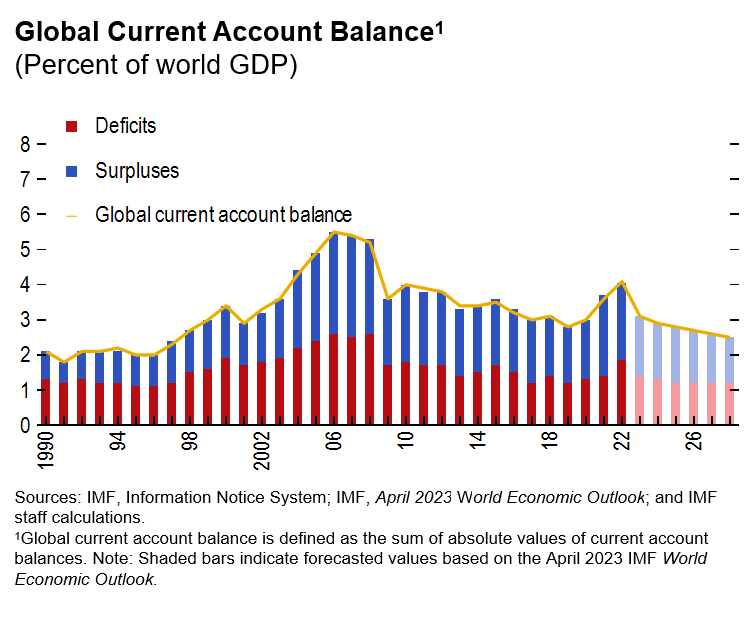
Let me just begin by today's talk with this is time series chart essentially that clause what is so called global current account balance which is defined as the sum of absolute values of current account balances for the world economy. The issue is that some of those current account balances or some of the current account surpluses or deficits are what are so called healthy. For instance, imagine a country that has an aging population. They can typically save more, therefore they should run current account surpluses. But on the other hand, like countries with the faster growing economies that emerging market economies, they tend to have high productivity. Instead, they should be typically should invest more attract capital from advanced economies. And they tend to run current account deficits. But unfortunately, not all of the current account balances are what I so called healthy. The unhealthy part of we call it global imbalances actually pose a risk to the global economy as it triggers trade tensions, also causing abrupt capital flows.
Now the main question or the difficulty is that how do we distinguish from this chart which part is healthy and which part is unhealthy? Hopefully not surprisingly, this is where the external sector report in acronym ESI as many acronyms at IMF and then this is just another one of those ESI comes in. And essentially, just to reiterate what it does essentially improvise the so called multilateral consistent assessment of external positions of world largest economy. And a bit more specifically, when we talk about external positions, we will focus on five aspects of it is include the current account, real exchange rate, capital flow, external balance sheets and international reserves.
And in doing so, the reports trying to identify what is so called excess current account deficits and surpluses, global imbalances and the report also tries to detect external sector vulnerabilities that be the associated with the stock position as well as the currency composition. The reports trying to discuss some policies that try to promote an external rebalancing. And finally, i'll just to say that this report fulfill one of the core IMF mandates, which is to maintain international monetary system’s stability. With that brief introduction, let me just give you the outline of today's presentation essentially two parts. The first part based on the first chapter of the report that talks about external sector development in the last year, we briefly talk about the outlook for the global balances as well as the risks associated with it.
And then third section which will briefly introduce how do we go about and then identify the healthy or unhealthy part of the global balances for 2022 and else present the results. Finally, briefly touch on the policies to promote external balancing. Then I will move on to the second chapter of the report, which is typically what we do is that we focus on one analytical topic. And it will take a deeper dive. And in this year's report, we look at the external sector implications of what so called global dollar cycle, which will discuss and define more later. And when we get there. So with that, let me turn to the first chapter of the present take order of the report of first part of the presentation is essentially is the same kind of thing for that again for of the global current balance.
What we've seen is that it's called the so called global balances is on the rise for the third consecutive year. It increased again in 2022. And several factors affected this improvement including increasing commodity prices, which is you can see on the chart on the right and also an even recovery from COVID and the tightening of monetary policy has also contributed to the widening of the global balance.

Second, there's also a lot of volatility in the currency market of 2022. Starting the chart on your left, you see this a dollar, a real effective exchange rate where the dollar essentially as appreciated by about 40% by October 2022 compares average in 2021. This essentially reflects a strong fundamentals in the US as well as the tightening of US monetary policy. But what is interesting in this, what I so called dollar appreciation episode compared to the past is that you see that the dollar has strengthened much more relative to other advanced economies compared to the EMs. Whereas in the previous episode, dollar tend to appreciate more with EM currencies compared to advanced economy finances. Part of the reason we think is because of increasing commodity prices that has supported some of the EM(emerging markets) commodity exporting currencies. So that could be one of the reasons I explained the better performance that of the young currency relative to other advanced economies with dollar, not being said that many EM currencies have experienced very large depreciation pressure in 2022.
As you can see the chart in the middle where we plot the so called exchange remark index, that is a way to better capture the depreciation pressure on the EM(emerging markets) currencies just to describe very simply. Like a positive number means the higher depreciation pressure that a country currency experienced in 2022. The reason that we plotted is a exchange of market pressure index is that just focusing on the headline index or the headline exchange rate is that this index give a broader picture of accurate and depreciation pressure that the currency faced, because for instance, some policy actions, including in increased interest rate or doing FX(foreign exchange) interventions can mitigate the observed impact on exchange rate.
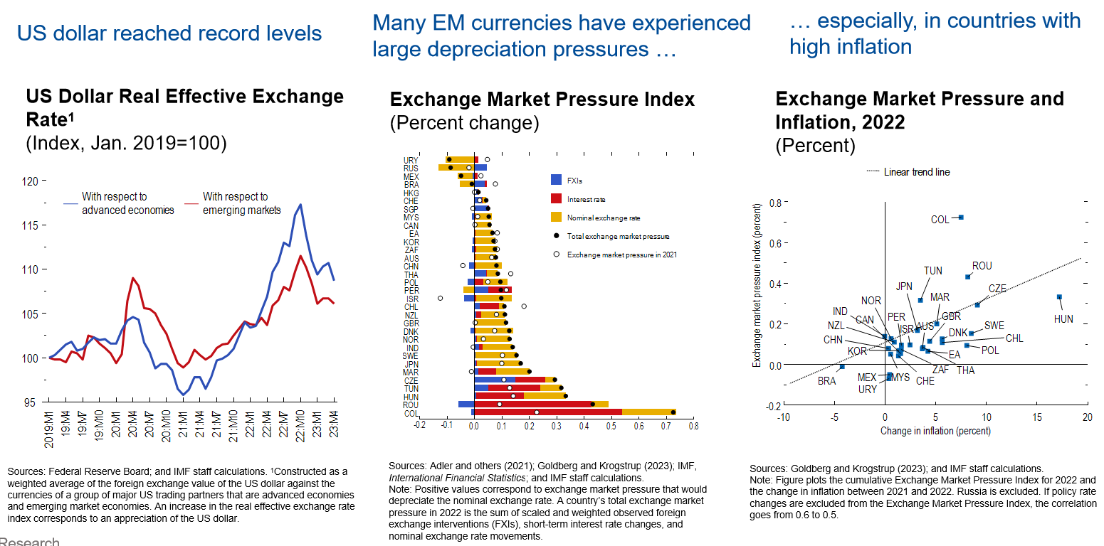
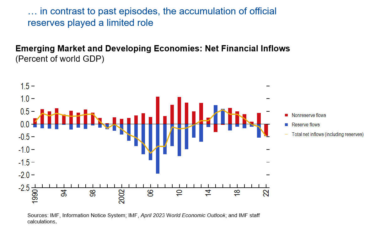
We looked a little bit deeper. What explains this? What are the characteristics can be associated with a stronger depreciation pressure? We find that economies that has a lot of higher inflation or weaker institutional factors tend to be associated with a greater depreciation pressure. With that, let me move on to the capital flows and the better than I do actually at the standard economic theory would actually predict that capital should flow from faster growing. I'm sorry, capital abandoned, advanced economies to fast growing emerging market economies. That's what so called down-to capital flow. However, the reverse happened in 2022 where we can actually seen that capital flow out from EM developing economies to advance economies. This you can see on the is very large the negative yellow line you see on the chart itself. But this is actually not the first time that we observe. This was so called uphill capital flows like in the mid-2000, it was many years are so associated with uphill capital flows. But what is really unique or different in the current episode or in 2022 was that this outflow was really driven by what so called non reserve outflows. Whereas in the past, the outflows, majority of the output reflects that EMDE(emerging markets and developing economies) are accumulating reserves.
Now we think that a little bit deeper into the financial accounts just try to see like what can explain its capital outflows in EMDEs or which sector was driven this capital outflows in the EMDEs. In particular, we find that essentially a lot of this net capital outflow is driven by portfolio flows. This you can see on the second panel, on the chart, on yours, the and then this could be associated with the rising interest rate in advanced economies where essentially that the investors are putting the investment out of the EMs essentially searching for higher yields. Other than we also seen that FDI(foreign direct investment) inflow slow quite sharply in2022 that the FDI goes to EMDEs.
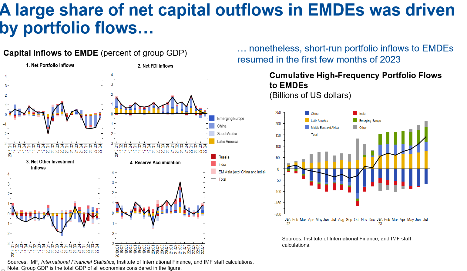
And also we see that consistent actually with the previous chart that reserve accumulation also stored quite significantly 2022, not like what I would say more positively. What happened in early 2023 is that seeing that short run portfolio inflow EMDE has essentially resumed to large part of the EMDEs this is what you can see on the chart on your right? We talked about flow. Let's move to the stock position here. We are focusing on country's net international investment positions. So essentially you can think about this is like the accumulation of the current account happened in the past. What we've seen is that the so called creditor and the debit of stock position remain very elevated in 2022. This essentially reflects to offsetting forces. On one hand, we have a very high current account that essentially continue to enlarge the net international position in countries. But at the same time, what is so called evaluation effects which actually offset this widening effects coming from the current account. This is illustrated on the track on your right, we bought countries net ip position on the vertical axis without evaluation changes for those countries.
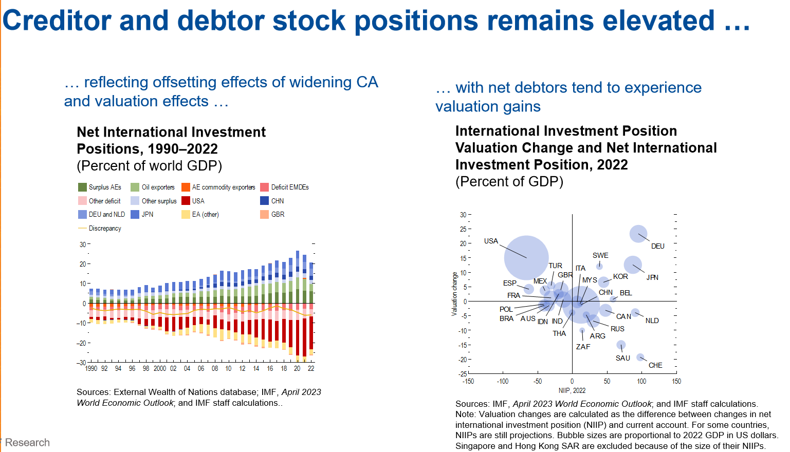
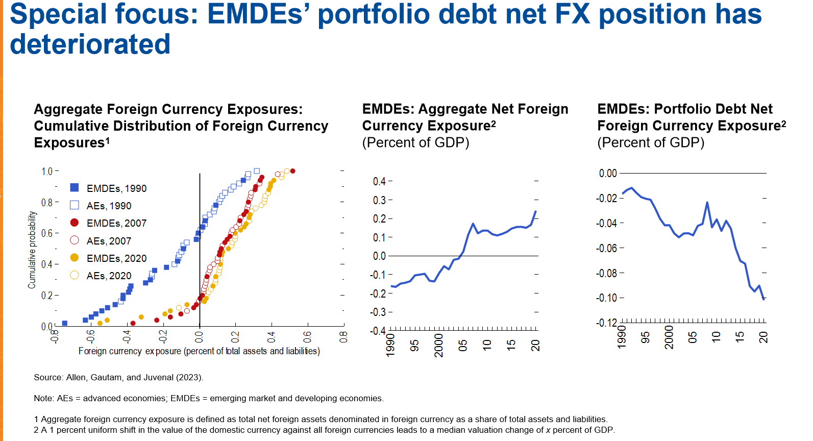
And then you can see this negative correlation, meaning that in countries with negative NIIP(Net International Investment Positions) , so debit countries, they actually tend to see valuation gains in there for their investments and then for country that has a positive and I means that they have more investment board than what they own to the rest of the world. They tend to experience negative valuation change. Sensation is an aviation changes that interesting is actually playing if I record a civilization role of the international investment position for countries, we discussed the size of the NIIP but not just the size matters. Also the currency composition also is always important because imagine a EM country that were a lot with this from external countries, but in foreign currency, then those countries are typically associated with very significant adverse balance is affected when it's currency increases.
That's why just get getting a better understanding of the currency composition of the NIIP position. So it's important. This is what we do in this year's report. Essentially, we looked at the foreign currency exposure of each country for the assets and liabilities, then starting the chat on the left, what we do is that we essentially profit the cumulative distribution of foreign currency exposure. You can think this is essentially defined as the form currency that I can hold. Is there a foreign asset minus the foreign currency they own to their own trading partner? So a positive number, which means that the country was actually long in foreign currency. So they own more foreign currency assets than what they have in foreign currency liabilities. And each of the dots on this chart represent an economy that in our sample, then the chance has three lines corresponds to three different time periods where the blue dots corresponds to the position in 1990. The red dot represented position for the seven and the yellow dot represent the position in twenty, twenty. You can see that clearly that the dot has essentially shifted towards the right as time goes back.
What it means is that essentially more EMs are basically becoming long in foreign currency in the net, In their foreign exposure, which is a positive news. Basically, it says that the currency risk it's basically become lower over time. So the china middle is actually plot the same picture as what we show on the left. Instead of probably the whole distribution, we essentially just focus on the medium of EMBEs net form times exposure. Again, you can see this increasing trend over time and the fact that the medium net exposure has improved from a negative number, which means that EMs was short in foreign currency to a positive number means that the end become long in foreign currency is again, another way to say that the risk associated with the domestic housing depreciation has reduced. but now all the development has been very positive, unfortunately. And what like so far, we only presented a picture for the aggregate position, but if you just focus on portfolio debt, which is like a component of an idea that tend to be a riskier because they tend to because investors can move money outbreak from their investment position bonds. The foreign currency exposure has actually deteriorated over time. So bottom line from this is that there seems to be some improvement over time in the first in foreign crimes exposure. Not all the news is that good.
Now finally moving to quickly move on to the outlook for the global balances. So this is the chart that you've seen for the third time already in the last 15 minutes. But what I did here is a bit different is that we extended discharge to the next 5 years which essentially is based on IMD forecast for the current account balances and you see that we do expect a sharp drop in the current balance in 2023 and is continued to decline go forward. Essentially, this reflects three forces. First of all, is that we would expect effect from the Covid as was the war in ukraine that we talk about the commodity price is going to resuscitate. And also we do expect some policy effort is going to be in place that helped to narrow this global kind of imbalance. And over the medium term, I don't want to put so much emphasis on outlook of itself to say, but instead, I think it's important to recognize the multiple risks associated with it. In the report, we discuss more progress that associated with outlook, but let me just focus on one of those that seems to be particularly relevant in today's environment, which is so called geoeconomic fragmentation.
In the report, we specifically ask two additional questions around this risk. First is that we ask has increased risk of geoeconomic fragmentation, affected financial recycling of large current consequences. Related on still on the person side, has it also affected the funding of the us current deficit? The second question we ask in the report is how do higher trade costs, which is part of the geoeconomic fragmentation affect kind of current account balances. So in the interest of time, then just first focus on the first question and i'm happy to take to discuss the second topic. It is interesting. Here, let me just briefly present the finding that we related to the first question. So I think there are three key messages. First of all, we find out that in the so called interdependence between large surplus and deficit economies remain large impact. So we don't see all clear signs that it's a risk of finding that the economy's lifetime deficit.
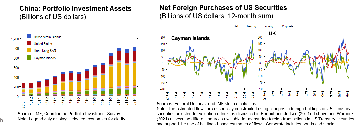
The second thing we find was that this currency composition of official effects preserves has remained largely stable in the recent years, in particular with US dollars, still accounting for a majority of total allocating reserves in our survey. But there have been some changes that we observe in the box in this analysis. First of all, what we've seen is that the so called the role of financial center has clearly increased. Let me just ask you to draw your attention to the chart on the left, which essentially crossed the china portfolio investment assets abroad and broken down by geographic locations. Hong kong, and US still account for a large share of the foreign investment from china. But let me just ask you to look at the very little green by the bottom and the blue by the top. So the green represents china's investment in cayman islands and the blue bar represents an investment in british virgin islands. Admitted it is the bars are still very small compared to the size of above Hong Kong but the us but it's interesting that you see this bar is really growing, has grown over time. So that's one of the supporting evidence that we've seen that this will be so called the role financial center has increased to account for china and foreign investment.
Now, if I can let me ask you to pay attention to the two charts on your right here what we call is the net purchases of US securities again, broken under geographic occasions. Here we do into two economies, cayman islands and UK sorry, for so many lines because they just essentially represent different US securities that invest in those country hold. But if you look at the blue line, not sure if you can see, but clearly I hope you can see this upward trend. That is basically meaning that it has been somewhat a lot more investors come from cayman island and uk holding us security in recent years. Then let me just point out these numbers are very large, and these numbers are significant, especially when you compare to the GDP in those countries. This seems to give some indication that it may not be the actual invested in those countries, but instead of investor abroad using those countries, the heart of holding us securities, then the second thing that we find in the box that has something has changed is that the so called the role of non official sectors has increased. Specifically, what we mean is that if we look at the accumulation of FX reserves by china and saudi arabia, two countries that has a very large current on surfaces has decreased basically right after the global financial crisis.
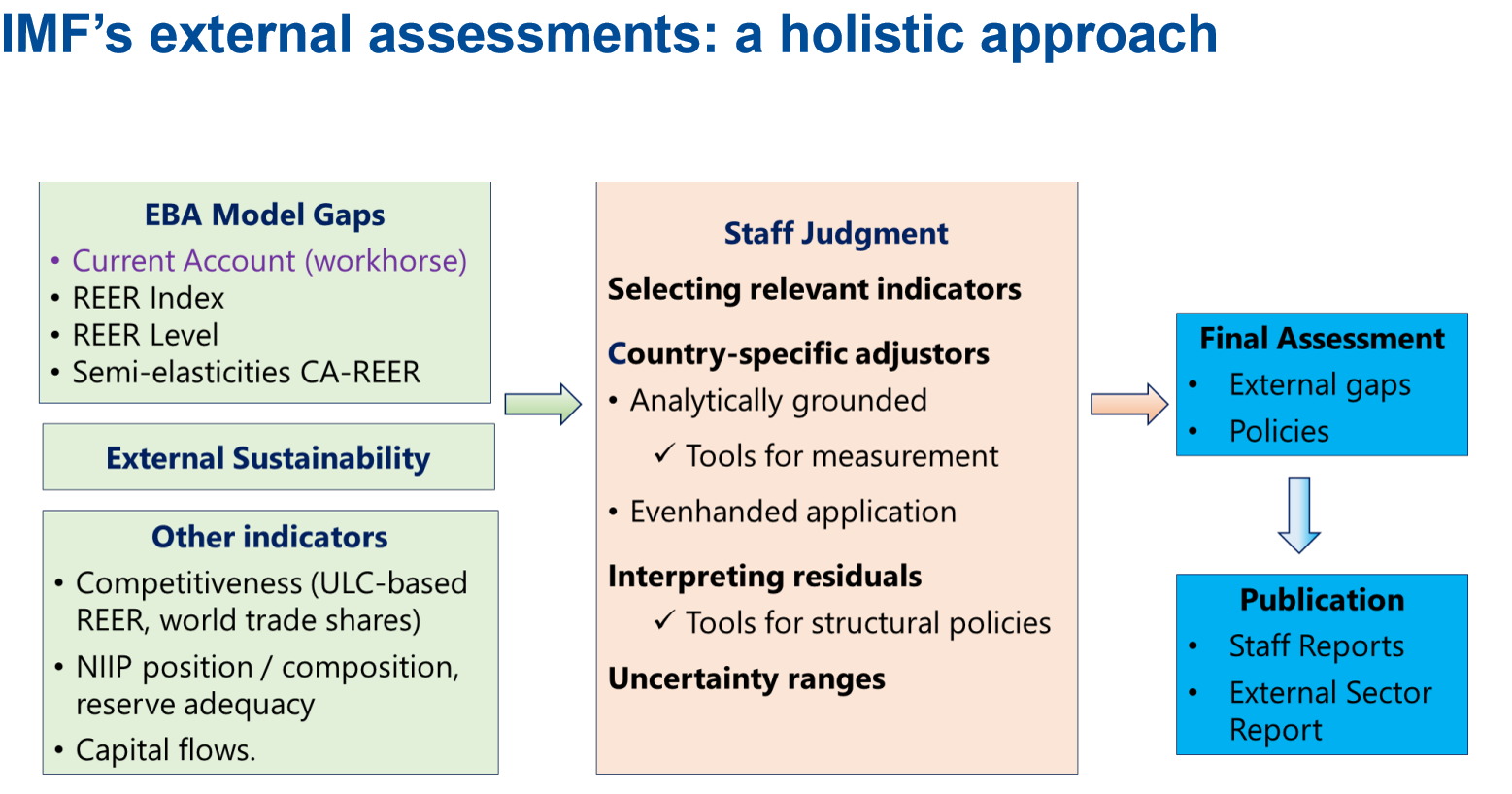
With that, let me just quickly turn to discuss a little bit how do we go about is so called identifying healthy quote unquote and unhealthy part of the current imbalances and surface. This is the so called IMF external sector assessment. And very broadly speaking, at very high level, I would say the assessment consists of two parts. One is the first party state degree boxes, which we have a suite of models that help us to give us like a first numerical benchmark of what the current should be in the medium term and what exchanges should be essentially in very brief arrange. I'm simplifying a lot, but that's what the gist of it, what it does. Then once we have those model results, also recognizing the fact that there's no one model is perfect and capture all the what's going on in the world. Then what we do is that we lay on top of the numerical results with them with so called staff judgment. This is where like our research department is accountable for the models. And once we have the model results will go to the country teams and discussing with them in the sense that what are we really capturing or what we not country that is very unique to each country and to what extent we have to negotiate and call it negotiate or discuss, we can actually combine.

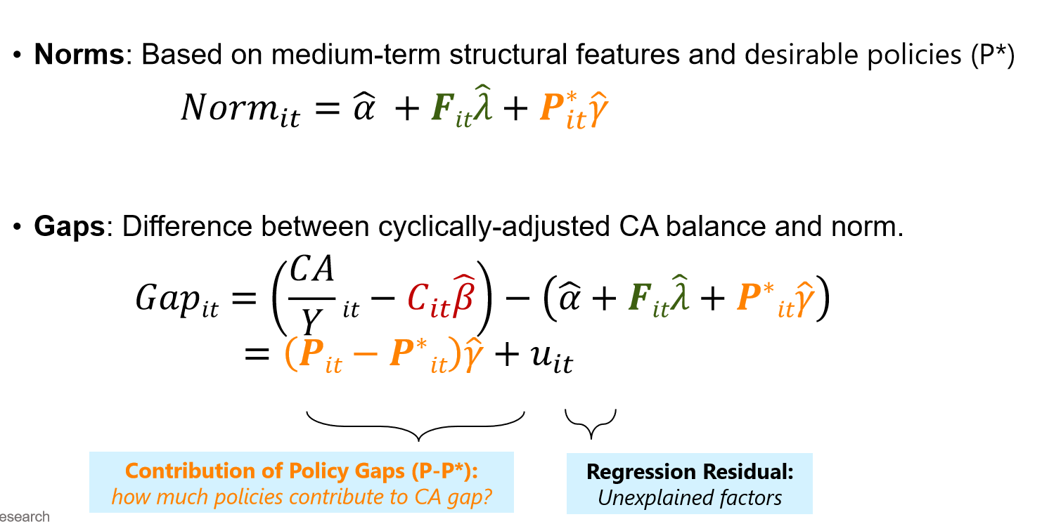
And these two input is the final attitude to reach and what is so called the final assessment of the external position of the country. But that being said is so called current account model is still really the workout of the whole exercise. Really the starting point of the assessment. Let me just quickly describe me what is this current model is. Essentially, it's very simple. A is a panel regression that relates the current account as a share of GDO on a bunch of factors that the literature has a day. In fact, the importance affecting the kind of current account balance. What is speaking? You can break down the factors in three buckets. The first bucket is so called the cyclical and short term factors. This include alpha gas, commodity terms of trade like the idea and changes. So for instance, just give me the one example. When is increasing oil prices that decision automatically drive up the current compounds for export all the exporting countries and vice versa for all people in countries. The second bucket of factors, which is that we so called a macro fundamentals or also as well as some structural factors. One example I want to start from this that is so for demographics is go back to the idea that for an economy with 18 population, they tend to save more current account balance surface and then the last bucket of factors will be called actual policies.
And then these matters, for example, in a country that reads very large current fiscal deficit that automatically drive down public saving and that will be associated with a more negative partners. Once we ask, once we have an estimate of that panel regression, and we can use the estimated coefficient to construct what is so called current income norms. The norm you can think about essentially is a benchmark for the medium term current account should be, it's essentially a combination of the structural features, the structural factor that I just described you before FIT it's based on the desirable policies. So the norm is not constructed on actual policy instead of desirable policies because again, the norm essentially provides adventure for the medium term current account and the desired policies. Essentially, the IMF staff assessment of what policy should be over the immediate term. Then once we have a normal, we have the benchmark for the current account is relatively straightforward to construct a gap. The gap, essentially, the difference between we call it simple adjusted current account, which is that you remove the cyclical factor contribution to the actual current account with a bit of the norm or the benchmark. You can just think almost like a gap between the current account and the benchmark of the norm that we assess.
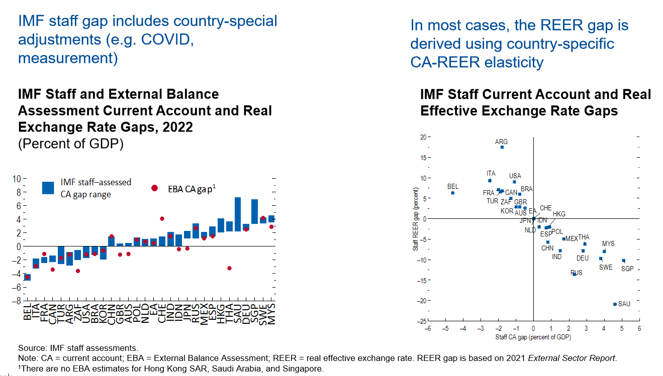
That's a in a nutshell, two slides, a brief summary of the current model in the EBA exercise, which is a key component. And in that section, let me just quickly present you the results for 2022, the assessment for political external assessment. Here you see so essentially across the current account gap, the positive number means that the security adjusted current account in 2022 is above one should be open in ten. The negative number means that the current account is below what it should be in the here for each other countries, as you will see, two gaps. One is the red dot, which is so called REER gap, which the gap that comes straight out of the even regression model. Also the blue bar, which is so called IMF staff assess the current come gap is this thing. In most cases, you will see these two gaps are consistent with each other, but there are some exceptions that different. Let me just give example at thailand because that has the largest difference between the current account, the evil current account gap, and then find staff assess the gap. This is purely because the even current account was not able to capture the effect from coal fully. So essentially what we do and because Thailand is an economy that rely heavily on tourism because of the travel restrictions that had a very big hit on their current compounds. Therefore, what we do is that because again, the current conflict, the deep access is more about the millions of the current account.
So we say that we make an adjustment to the headline current income in Thailand to say what kind of compound should have been if they will know this temporary travel restrictions associated with COVID. And then we compare that adjusted current account with the current account. So that's essentially explains this big gap between the current account gap that calculated directly from the regression. But the overall messaging from this chart is that actually we still do see quite a large global imbalance across the economies. And then this imbalance was actually, in fact, declining over the last 5 years until 2022 that is the current trend has stopped. Once we have this kind of current gap, we can quickly actually translate it into the so called real effective exchange rate gap.
The first starting point is actually just to use the country's specific current account to REER elasticity. And then this is the chart and then because this is the way we started doing it, you will see very high correlation between current account gaps which is used about it on the X axis on the chart on the right. And REER is starting on vertical axis on this chart here. What it means is that for a country that has a stronger kind of composition in this benchmark is a positive current account gap. This is a quick summary of the EBA(External Balance Assessment) as well as the results for 2022. Let me just finally move to the last slide for the first chapter, which is the policy that how do we go about to close this kind of balances?
I would say the policy recommendation consists of two parts. The first part is that the recommendation for individual comments, this policy will essentially depend on the position of the economy. So specifically, the country that has excess surpluses means if the current account is above the medium term current account used to be, then the general advice is that when the fiscal policy is available, then government should increase public investment. In particular, in the area of digital digitalization and climate change mitigation. And on for the whole country with excess deficit means that the current account is actually below than the medium and benchmark. The general recommendation is that a fiscal consolidation they will improve, public sector saving would help to improve your current account balance and also a country should consider structural reforms to improve productivity and competitiveness of a country. That means that it’s also important to complement this country level policies with global policy efforts.
So specifically there’s three recommendations coming out from the report. First of all,we call it so strengthening the current rule-based trading system essentially to preserve the benefits that we got from the globalization. Secondly, it's important also to ensure any industrial policy do not introduce distortions, and the body has to be consistent with the international agreement and WTO rules. And last but not least is that we felt that preserving liquidity in the global financial system is also very critical to prevent shock and spills into the economy's origin from the advanced companies.
So with that, let me just take a pause or try to continue first? What will be the best way to do?Maybe I should continue and then we can take the question at the end. Okay, sure. So with that, let me just turn to the second chapter of the report which discussed external sector implications of the global dollar cycle. Why we pick this topic?Because each year like the wheel, we would take one topic and give a much deeper dive on. Why we do this? I guess the first question is that we observe the US dollar displays like a decade long cyclical patterns of the time. Why is this relevant?It is relevant because the literature has shown that when us dollar appreciates, it actually has very large and negative real sectors spillover in the emerging markets and developing countries. This is even after controlling for factors such as US longer policy and US financial conditions.
So a better understanding of this spillover is not just important. It's interesting for economists, but also is important for policy makers because that once we know what are the effects and how these effects affecting country, this is how the policy makers making and formulating the best policy response. And more very recently Obstfeld and Zhou in their book in 2022 paper has pointed this phenomenon as the global dollar cycle. So this is where the name comes from. What do we do specifically this chapter like essentially we focus on three questions? First, are there any external sectors spillovers from this so called the global dollar cycle?We look at the external sector, not just because this is the external sector report itself. It's also because as you will see that real effect exchange rate plays a critical role in final shots or mitigate the shots, as you see. Second question is that we ask do the effective across countries between EMs or the AEs and then how can we explain this heterogeneity that we observe?
Then finally, we're gonna talk about looking at what are the impact on global balances as one of the key it is that we talked about a lot in this presentation or also in the report itself. So this chart illustrates the US dollar index, which essentially the nominal US dollar against a basket of seven advanced major advanced economies, including Australia, Canada, Euro area, Japan, Sweden, Switzerland, and the UK. The reason I will focus on this index is because because we want to study that still was emerging market economies or other smaller advanced economies.
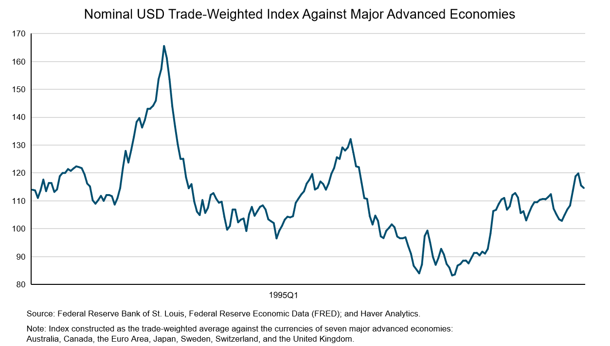
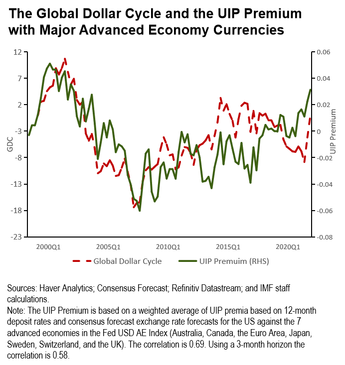
Therefore focusing index with the seven major economies is this index become very exogenous to other countries not included in December, but the picture looks the same. So essentially you can see that this very big swings in the US dollar. So the first appreciation episode, I would say, started around late 1970s and then the dollar reached the peak in about mid 1980 and the second dollar appreciation episode essentially start around in early 1990 and then the peak just right after the millennium. And now we are in this new round of a dollar appreciation cycle. After the global financial crisis, you can see this very clear up the trend of US dollars. So then we looked at what are the factors that can account for the us dollar appreciation that has been put forward by the literature?
Specifically look at the monetary policy in the US, rest of the world that we look at the policy differential. We looked at US monetary policy, sorry, US financial conditions. You can think as a factor that measures a long term US interest rate and economic activity. So these are the factors that they have been put together by the literature. I think, Not surprisingly, all of these factors has the correlation with the US dollar index that we thought we just see earlier, meaning that when this increase in the US policy rate, and when it's a tightening of the monetary financial conditions that tend to appreciate the us dollar.
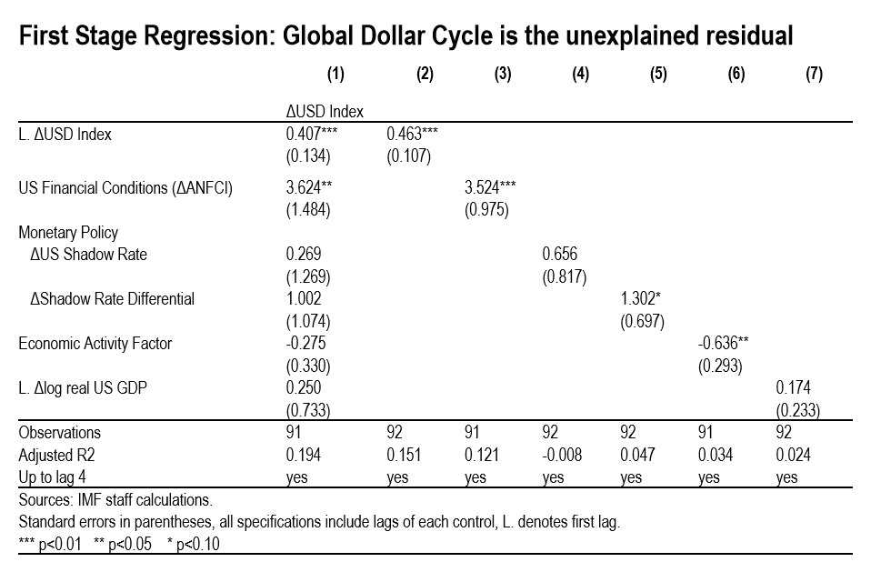
But despite we adding all of these factors into this, these factors together can only explain about 20% of the variation of the US dollar index. Let me then from now on, let me just define the residual from the regression as the global dollar cycle. Just repeat that the global dollar cycle actually is a residual that’s there’s something that we do not know. We cannot explain by the factors in the literature that goes towards the US dollar index. So this chart essentially reiterated message that we concluded from the previous regression. Essentially, you can see that the blue line logs the us dollar index within 7 advanced economies and the red dotted line logs what is so called global dollars?I hope this remind you the residual from the first regression. And you can see that this two line kind of correlate with each other very strongly, especially in the recent episode. In fact, the correlation between these two lines is almost 85%, which I would say it's not a surprise because in the previous life, we’ve seen that R2 from this regression is very low.
So how do we think about this residual like at the end of the day, this global dollar cycle is essentially been defined as a residual coming from out from the regression. The literature has tried to relate this global dollar cycle to reflect the global financial market forces. I mean this is essentially because of the very unique role of US dollar not in place a as save haven, currency itself. So intuitively what happens that in time of high financial sector distress with the risk aversion increase, invest attention for money out of countries and put it towards US was for safety. And that tend to essentially appreciate the US dollar.
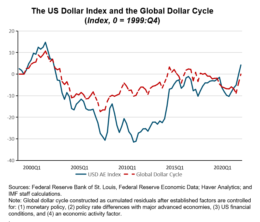
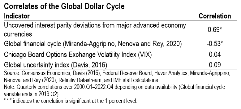
So I think that was the story put forward to explain this group without a circle. And what it shows is that and instead of the financial market, acting as a shock amplifier from the macro economy to exchange rate actually the shock itself and the original. But unfortunately, we don’t have a direct measure of the shock of underlying shock in the financial market, So that's why what we again, we try to confirm this message, what the global dollar cycle measures with looking at a correlation between the growth of global dollar cycle. Recently, some of the observers that we can see and it can help us to improve our interpretation of the global dollar cycle events. Then you can start from this chart on your right. Essentially what he does is profit is global dollar cycle in red dotted line with the UIP risk premium. And UIP risk premium again is that I think the additional return that investor asks to hold a different currency other than US dollar. You can see that the correlation is actually very strong between these two factors like the correlation is almost 0.7 or 0.69 to be a bit more precise. And this confirmed message is that in times of financial market distress investor would actually want to hold the US dollar.
Therefore the dollar appreciates and also is the flip side is that investor would actually ask for additional premium to hold other kinds of non US dollar. That’s why you see the positive increase in the UIP. So that’s why that’s essentially explain the correlation between these two series here. And we also call it is that residual a global dollar cycle with some other indicators in the literature. First of all, is we see we find a very high negative correlation with the global financial cycle. This is because a negative number in that global financial cycle means the timing of financial conditions and are associated with US improvement in the global dollar index. That's what you see is a negative correlation, but the number is still very high. Somewhat surprisingly, we find very low correlation between the global dollar cycle recently that takes usually is a measure of risk and the global uncertainty index.
For the weeks, I think one of the reasons because we are focusing on quarterly series,that's probably why we can take up the sharp increases in the base itself. But just to summarize the key take away of this slide is that one way to think about the global dollar cycle as a residual is essentially the kind of captures the risk aversion in the financial market. Now let me turn to the framework that we use to look at the spillover effect. Essentially, we employ the same specification as in Obstfeld and Zhou 2022 paper, essentially is the local projection approach that looked at the impact of a US dollar appreciation from on set of macroeconomic aggregate as well as external sector variables for a set of advanced economies and emerging market economies.
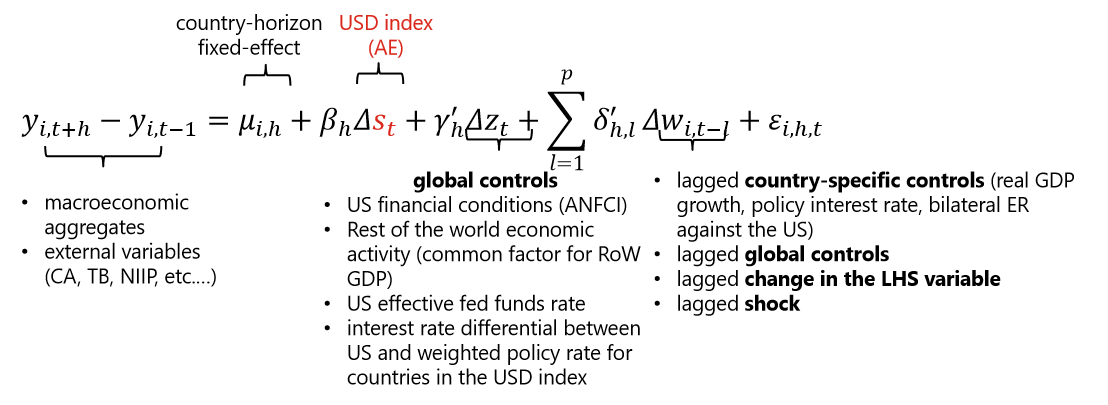
And in the regression, we also control for global variables that includes US financial conditions and the rest of the world economic activity and also country specific controls, including your GDP policy rate and a bunch of four buses like that will not not discussing here today. So the panel regression essentially estimated on about 34 countries that consist of 15 advanced economies and 19 emerging market economies. And there's a list of the countries. And the data is quarterly that setting from 1999 to 2022. Let me just show you some of the main results. This chart plus the impulse response from a 10 percent US dollar appreciation on advanced economies. These are illustrated in the blue line and on emerging market economies. These are represented by the red line. And each line is associated with the 90% confidently on each of the charts, let me start with the panel on your left. And these are basically what is so called the real sector variables. You can see that after the US dollar appreciation, output in emerging economies falls by about 2%.
And the fact is very persistent. These two percentage relatively large compared to the impact on the advanced economy where they're out with some 4×0.5%. Not only the effect is larger, the impacts are also more persistent. The negative and output job lasts for about 10 quarters before it goes back to zero. Whereas the negative impact on advanced economies lasts for about 3 quarters before university, a majority of this can be accounted by the decline in real investment. This is you've seen in the second panel, Again, we observe is much more deep and persistent impact on real investment in EMs relative to advanced economies. Both imports and exports fall in both advanced and emerging market economies. And in both cases, we see that imports falls much more than exports, which the falling imports could be essentially consistent with its sharper decline in real investment.
Now turning to external sector variables, like we've seen that, the current account actually improves in both advancing economies as well the emerging markets and the improvement in current account essentially accounted by the fall in investment, which you can see on the second panel, saving rate more or less remain unchanged in both country groups. But what is interesting is that let me draw your attention to the last picture here that the response of real effective exchange rate where you see that the exchange reaction depreciate in advanced economies, then just clarify the positive language is charged with depreciation, whereas the currency initially do not move in EMs. And this depreciation is in exchange rate actually held at acting as a shock absorber to cushion the impact in advanced economy. So the reaction of the real effective exchange rate could account for some of the differential effect on output between advanced economies and emerging market economies. Now let’s look at the financial variable how financial variables play a role in amplifying the shots on the impact of the shock in many economies.
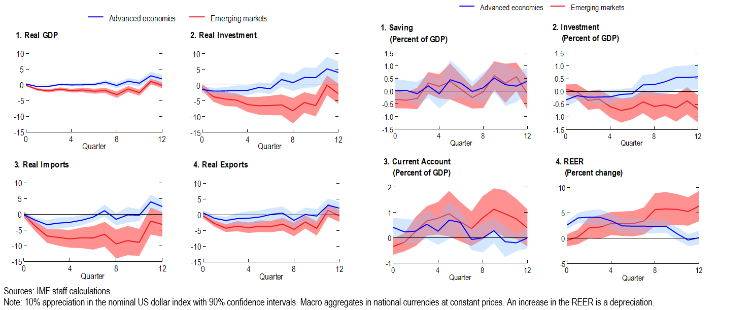
The first panel shows the private sector inflows to both advanced and emerging market economies. You see that inflows to private sector falls for both country groups. But interestingly, if you look at the inflows to the public sector, it actually increased for the advanced economies, but it declines for the EMs. What it means is that even after this appreciation shock, advanced economies do manage to attract capital inflows for the economy. So that could be another way to to cushion the buffer of the shock itself. In the interest of time, let me just tell you attention look at the policy rate. Here, again, you see that in advanced economies, in response to their shock at the central bank in the advanced economy, actually lower the interest rate. That's another way to essentially to provide a support to domestic economy. Whereas in emerging market economy, if anything, the central bank was forced to actually tighten the interest rate in response, which one of the hypotheses behind this is because in kind, if the inflation expectations less anchored in emerging economies and all the possible from currency depreciation was very high to inflation, then in response, the policymaker would actually have to tighten policy to mitigate the depreciation pressure, in view of this efficient effect instead of using policy to lower rate, to support the domestic economy.
We observe the domestic credit decline very sharply in the EMs relatively to AEs as well as the stock prices. Now I present you the overall result. And then the next question is like, what explains is difference in the negative spillover. Why the EMs tend to suffer more compared to advanced economies? Here we in the chapter, we focus on some of the characteristics that potentially could be relevant to account for these differences. For instance, this include the degree of entering inflation expectations, whether country is a common exporters or importers. So we explore these dimensions, but the purpose of this slide actually just trying to tell you it's actually very hard to identify with the source of the shock because for instance, one of the factors that we want to explore is that whether countries with a free floating exchange regime and perform better than countries they do not.
And then actually, what you observe is that let me just ask for your attention. Focus on this chart here is that countries have no free floating or other exchange regime than free floating. They are also associated with very high US dollar invoicing. In a sense, what we're saying is that if we observe the negative spillover effect, it's larger for countries without free floating regime. It's not clear was really the exchange regime that was driven the result. The result is driven by the high US dollar in currency but that means that let me just present the 2 set of results that we feel more or less comfortable and we have a clean identification.
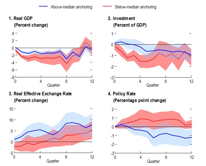
The first set of factors will focus on what the degree the invasion expectations were anchored. Here we only focus on EM sample and this big EM sample by looking one group that has above medium inflation expectation. You can think that a group of countries has a better anchor inflation expectations and the other group has less well and good inflation expectations. Hopefully not very surprisingly like we've seen that the output fall is much more smaller, is a lot smaller in countries with better inflation expectations.
Then again, part of the reason is that it can be really explained by this policy response where you can see the blue line representing the response of countries better and inflation expectation by current policy that provides a support of domestic economy, whereas the country that has less well anchored inflation expectation was essentially forced to increase interest rate as a response.
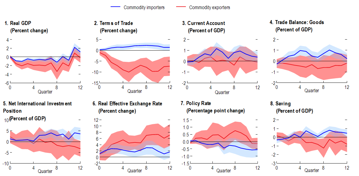
Only on to the second factor that we explore in the chapter is that we look at how does the effect differ between commodity importers and exporters. So here we focus on the whole sample, including bunch of AE, advanced economies and emerging market economies. The blue line represents responses for commodity importers, and the red line represents the input response for commercial exporters. And again, you see that for importers, the GDP fall was much more smaller in magnitude and compared to commodity exporters. And also the commodity exporters suffer a very large negative form of trade shock. In response, this is what you see in the second panel. So what can be accounted for this resource is the fact that historically, whenever we see the dollar depreciation, we also see a sharp decline in commodity prices. One of the reason is that or one intuition between this relationship could be that when the dollar appreciate that heightens the global financial conditions that reduces investment in reducing demand for commodities.
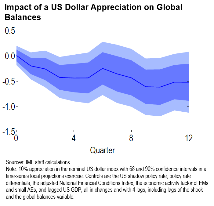
So that's why historically we typically see, whenever the dollar appreciates, we actually see that commodity price decreases. And then the declining commodity prices actually provides a cushion of benefits for commodity importers. So that could explain why the commodity importers have performed better relatively to the commodity exporters. Next we move on to the impact on the global balances because it's just one variable that we have been focusing on a lot in the report itself. We observe that when this increase in the us dollar index, when dollar appreciates, typically tend to narrow the global balances. This is where it shows on the chart on your right. And two potential channels can account for this. One is that when the dollar appreciates that decrease the commodity prices that essentially narrow the gap on surplus for commodity exporters. And now the current deficit for commodity importers. The second channel is that if you look at the dominant currency pricing theory that it suggests that when the dollar appreciates that tend to lower trade flows, so that could be another reason behind the declining global balances following a dollar appreciation.
Now last slide, it's really a interesting slide is just to remind you actually want to convey the message to you that when you look at the results of commodity prices, you have to read the result with a lot of caveat to interpret what would happen in 2021, 2022. Why? Because something very interesting happened in 2022, let's just look at the chart on your left that shows the change in US dollar index in the blue bar. In 2015 the US dollar appreciated and I was explaining to you earlier typically when dollar appreciates, we see the commodity price falls and this is exactly what happened in 2015. You see this almost like more than 30% fall of the commodity prices. But in 2022, the correlation disease to variable change, we see a bold appreciation of the US dollar as well as the increasing commodity prices. The commodity prices was driven by different forces in 2022, including the economic recovery from COVID that increases the demand of commodities.
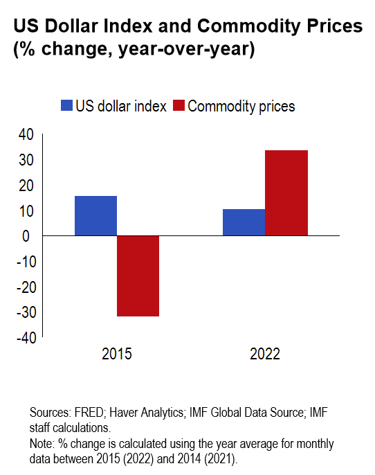
Also the war in Ukraine, essentially triples supply concerns, but this change in correlation between these two variables, apply some caveat to interpret our results where we typically see that commodity importers, whether the shock better than commodity exporters. So just again, to illustrate this point, we plotted the commodity trade balance in in the middle, on the x axis for several countries. And then we got the new GDP growth forecast revision on x axis. And you see that in 2015, what happened was that the country that tends to have a positive commodity trade balance, they suffered a negative growth revision meaning that this decline in commodity prices actually led to down the division to their GDP to go forth.
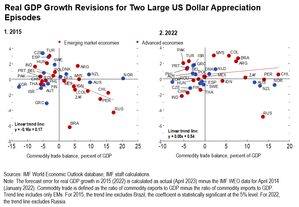
And then the last chart on your right plots the same picture of 2022 where you don't see this negative correlation anymore. Again, this is just because in a sense that we don't observe a downward GDP revision for commodity export anymore. If anything,their forecast was actually revised up. Again,it's just to show that how commodity price is really played a major role in affecting other spillovers from the dollar appreciation and how to change depending on the commodity prices. So let me just conclude today's top five to wrap up the second part of the chapter, so a few main messages. First of all,that we've seen that the global dollar cycle has a negative real sector spillover that's consistent in the literature. And these spillovers are more pronounced and longer lived in emerging market economies. Second,after a dollar appreciation,current account increases and essentially driven by the weak investment in EM and the real effect exchange rate played a very critical adjustment role in advanced economies,but unfortunately,exchange rate does not adjust on impact in the ends,but that only appreciate the depression gradually. And financial channel also contributes to the adverse effect by reducing capital inflows as well as domestic credit. And commodity exporters magnifies the spillover,given the historically negative relationship between the US dollar and commodity prices. But just to remind you that the correlation changed in 2021 and 2022, and we see that global balances tend to decline when the dollar appreciates. And then last not least two policy implications coming from this chapter, one is that we find countries with more anchored inflation expectations and more flexible exchange regime can actually help to speed up the economic recovery. So with that,let me just end today's presentation with some I would call it useful links, and especially I will throw your attention to the second that we have a very interesting panel discussion with both policy makers in the US and emerging markets coming to discuss on the report. And then the last we can find a lot more detail about how do we go about making the external sector assessment. And it's a working paper online. So with that,thank you so much for your attention.